
Brand · Packaging · Art Direction · 2026
Rituaire
A ritual-led self-care line, designed as one system from wordmark to wrap.
- Role
- Brand strategy · identity · packaging · art direction
- Range
- Bath · facial care · bodycare · hair · matcha
- Year
- 2026
- Formats
- Sleeves · boxes · amber glass · airless · jars
Rituaire is a self-care line built around small daily rituals rather than clinical routine — handcrafted soaps, facial care, bodycare, hair and a ceremonial matcha.
I developed the brand end to end: the strategy that names the range, the identity that labels it, and a packaging system that holds sixteen very different products in one quiet world. The restraint is deliberate — soft grey light, honest materials, typography doing the work that illustration usually does.
02
Product world
Sixteen products, one atmosphere.
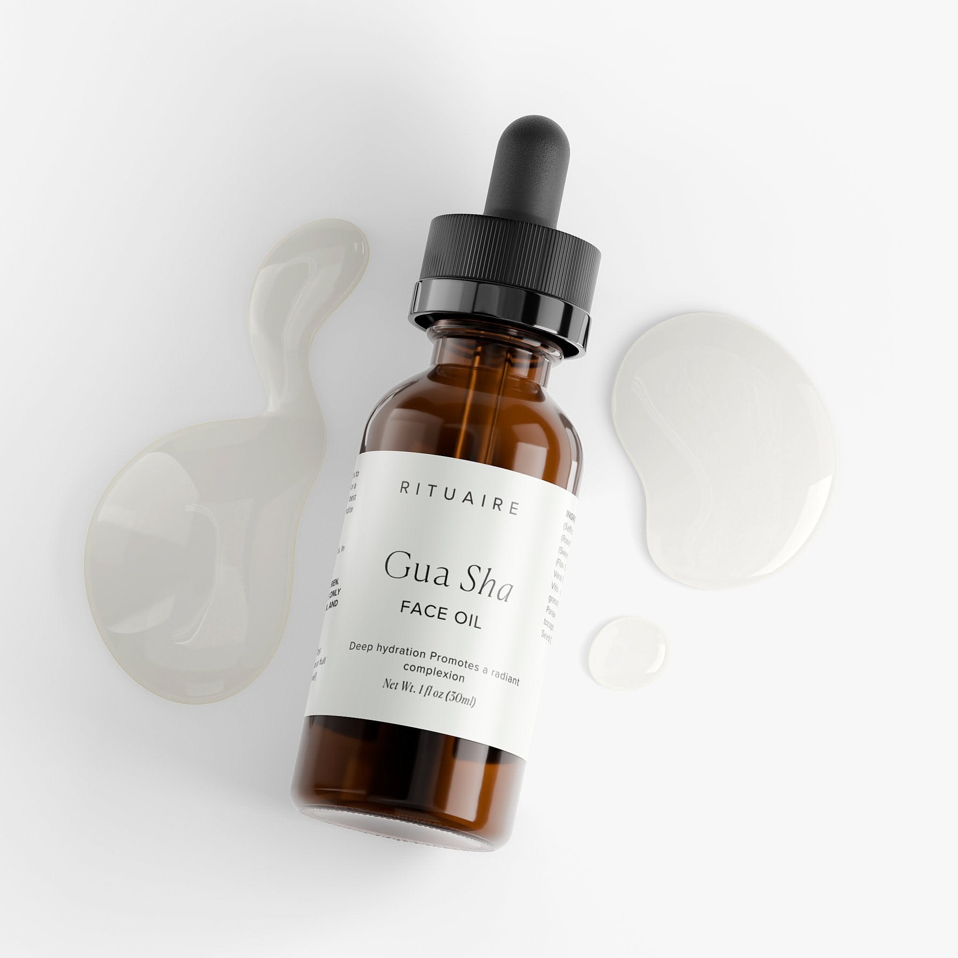
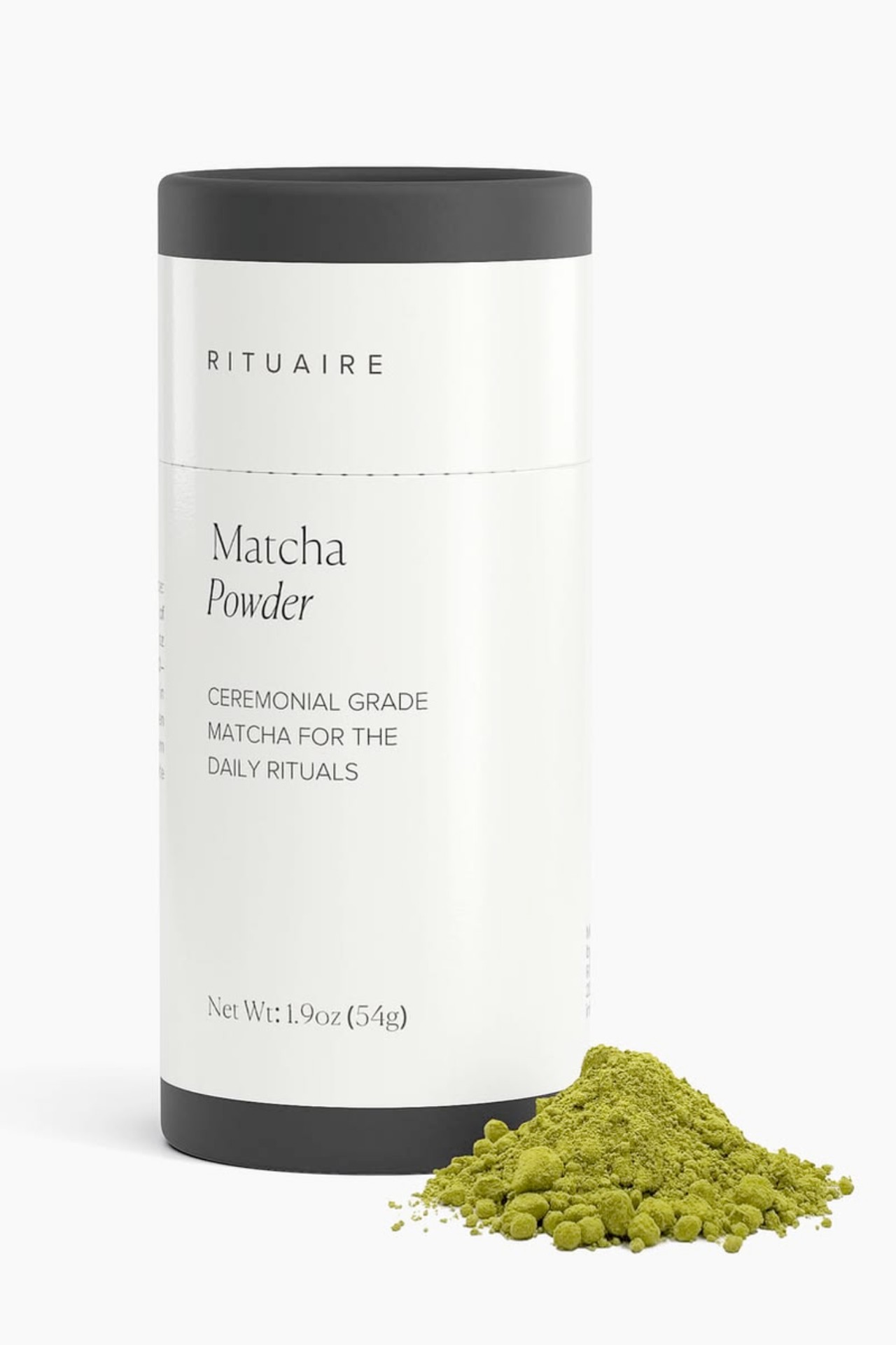
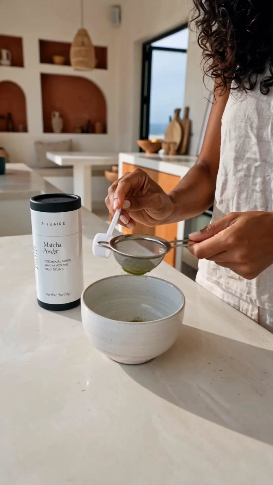
The range spans bath, facial care, bodycare and hair — each product cast in the same light. The matcha sits inside the system too: a daily ritual with its own tub, its own label, and a small pile of powder as the only prop the brand allows itself.
03
Brand strategy
Built around the ritual, not the routine.
The category default is clinical — actives, percentages, before-and-after. Rituaire is positioned on the other side of that: the morning matcha, the evening cleanse, the two minutes before bed. The strategy names the categories, sets the voice, and becomes the content series — After the Ritual.
04
Identity system
The label does the talking.
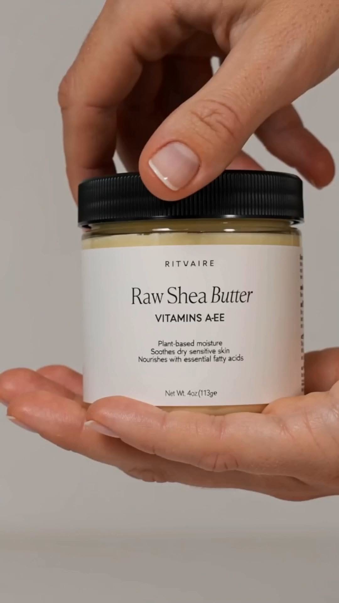
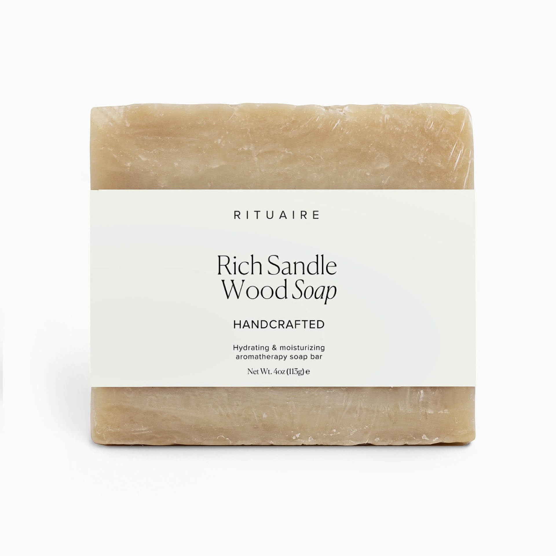
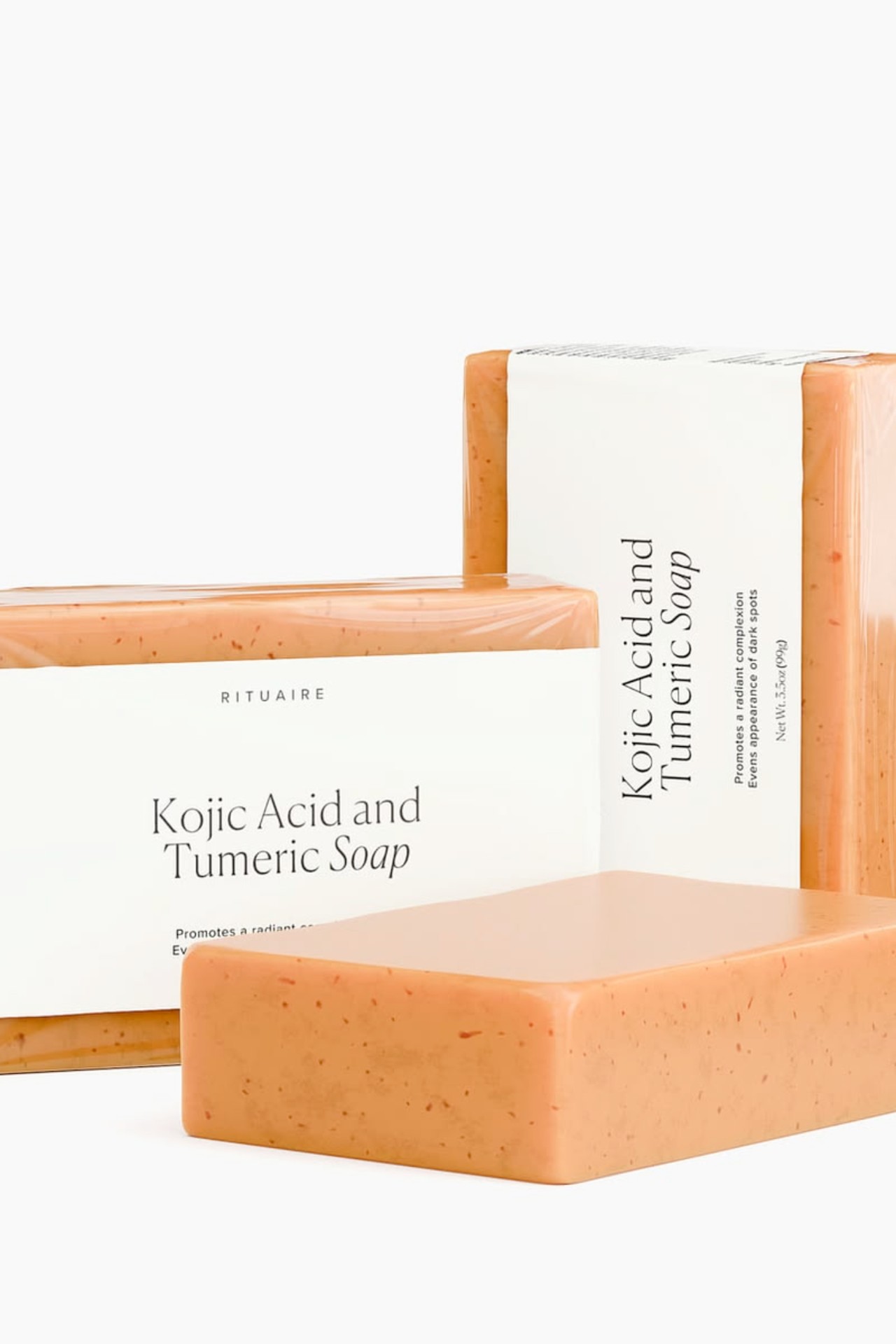
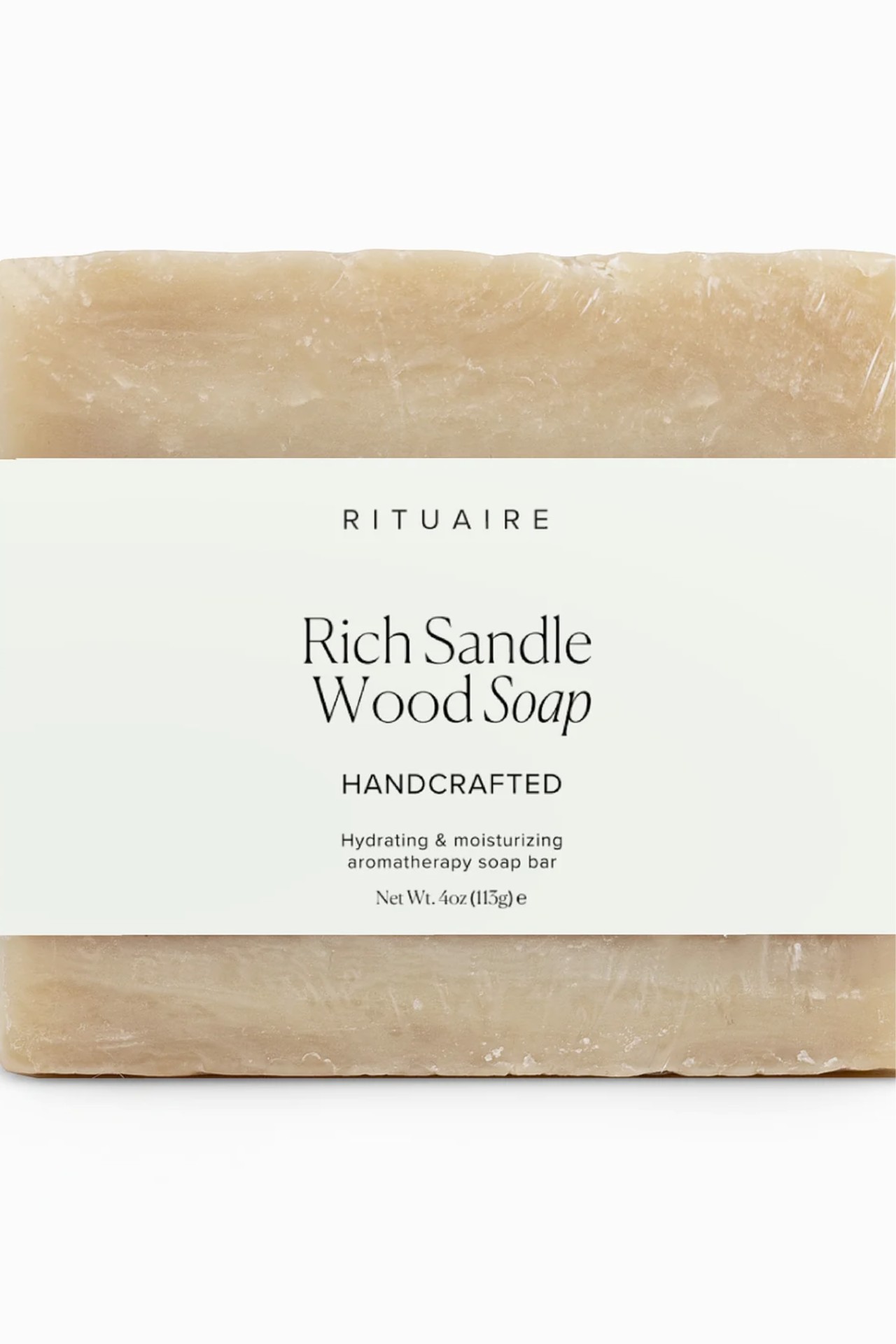
Spaced capitals for the wordmark, a high-contrast serif for the product name, small caps for everything functional. Three type decisions, repeated without exception — the hierarchy has to stay legible at forty millimetres on a soap sleeve.
05
Packaging range
One grid, every bar.
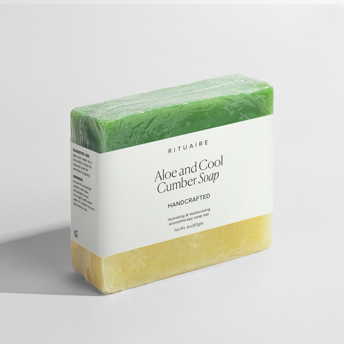
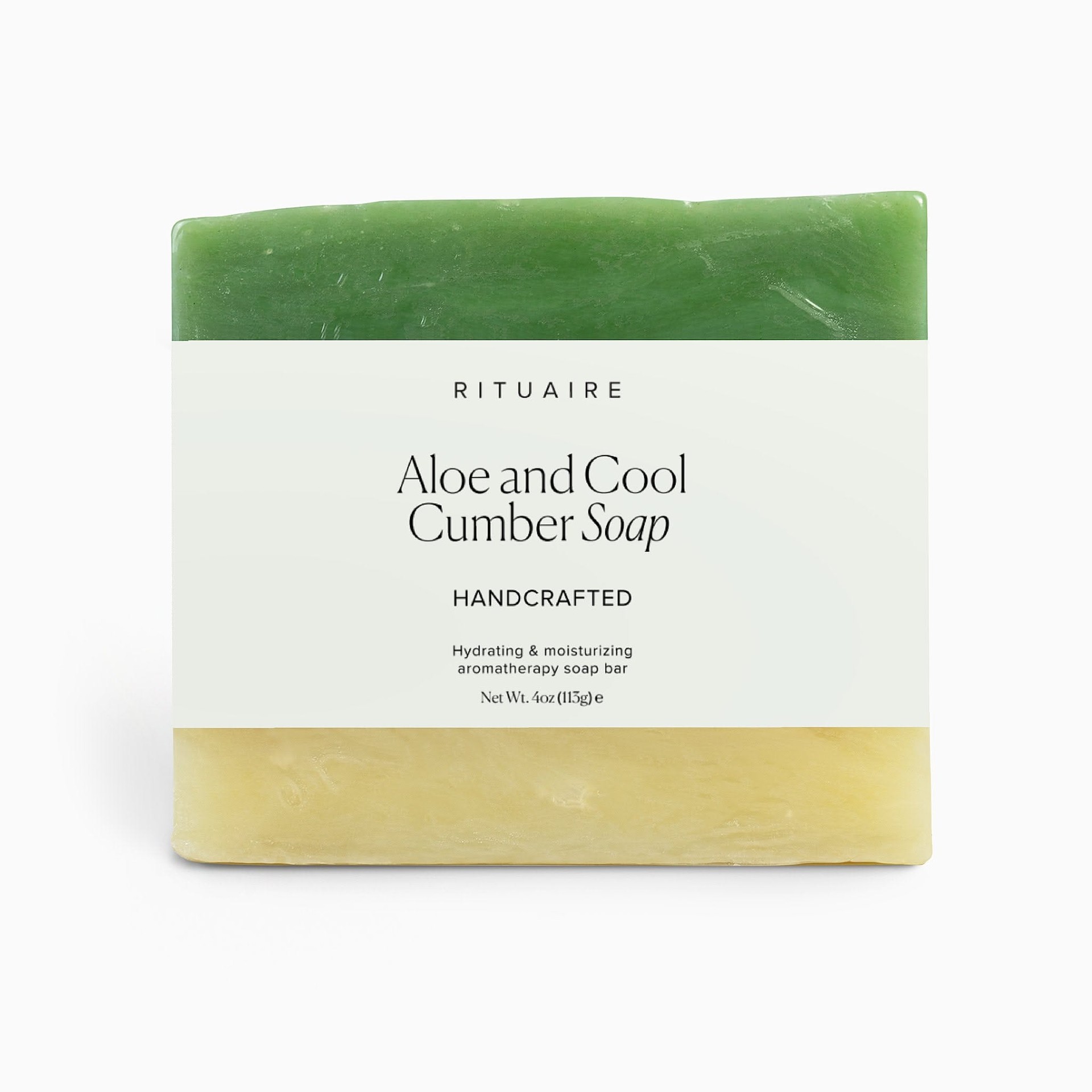
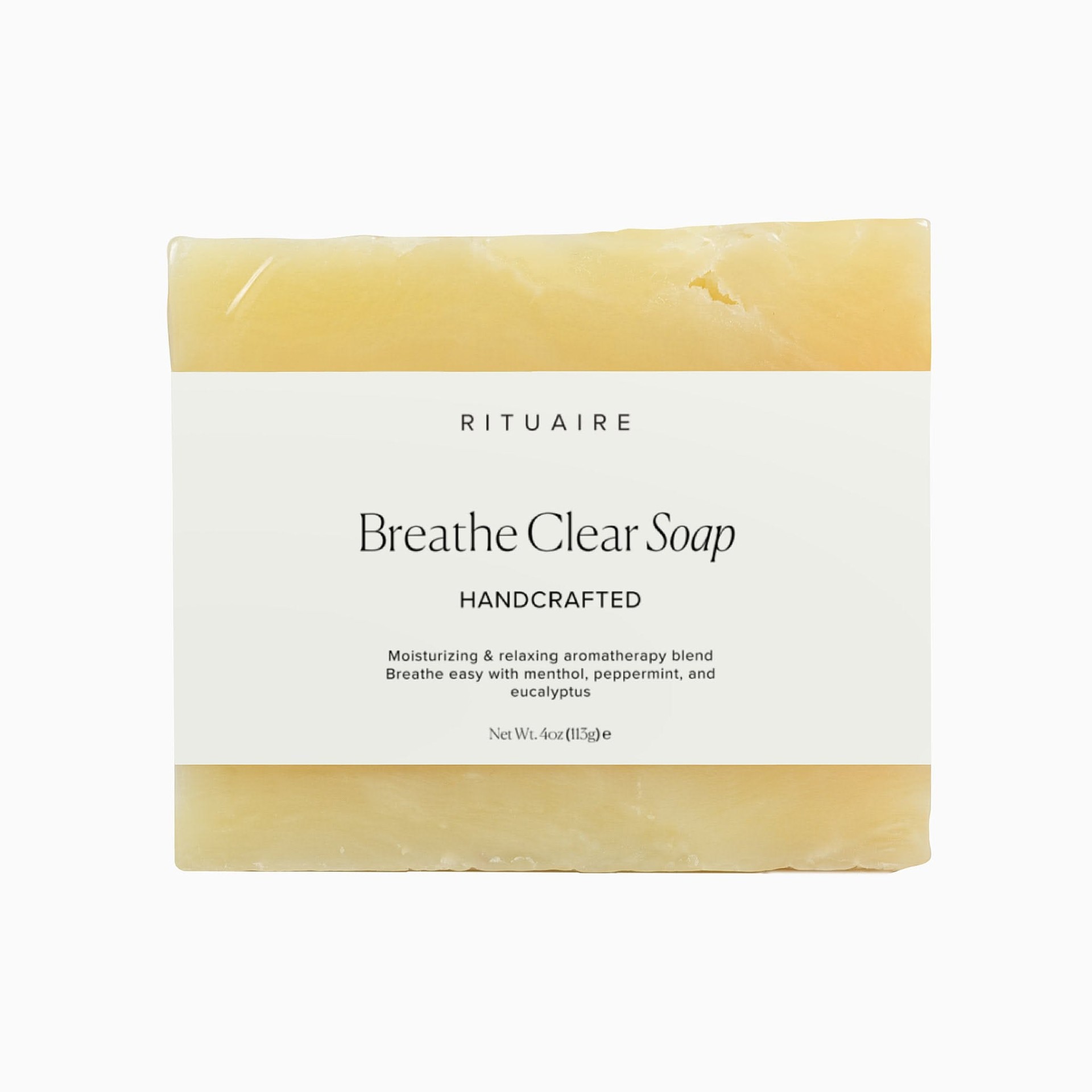
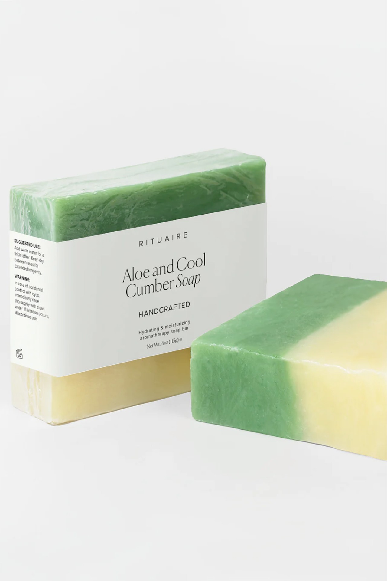
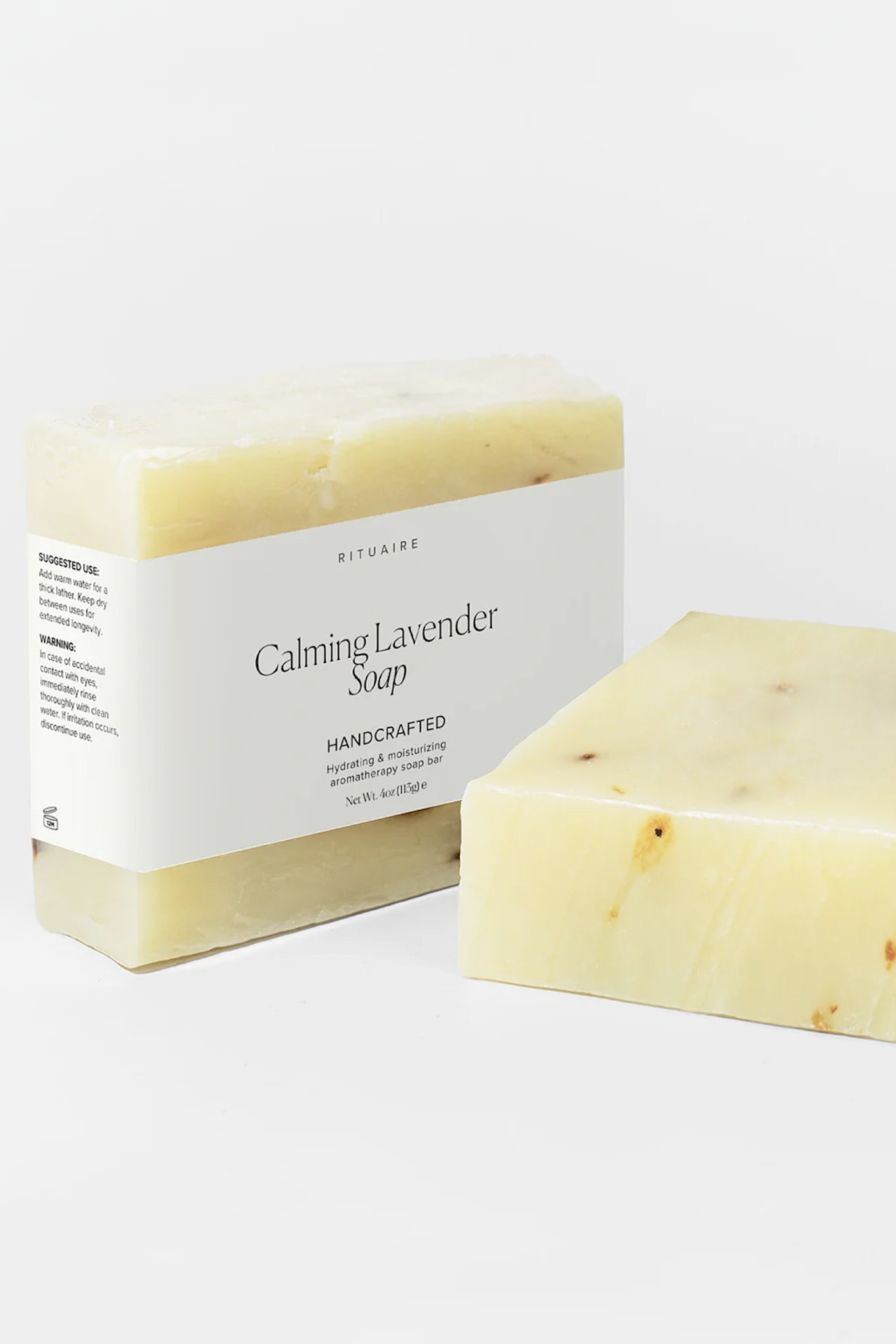
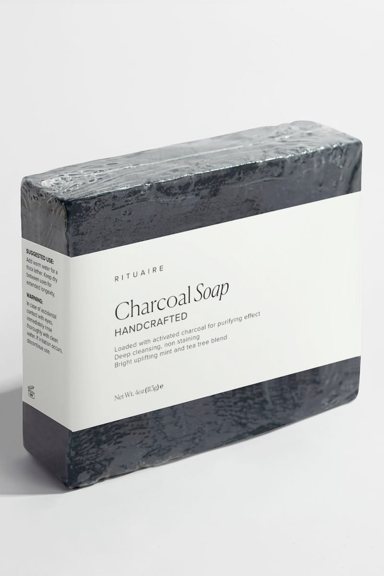
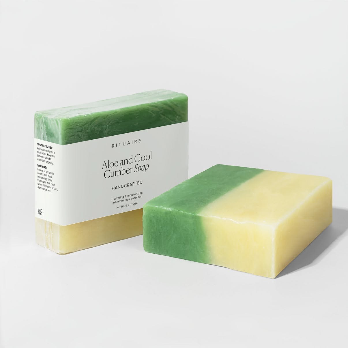
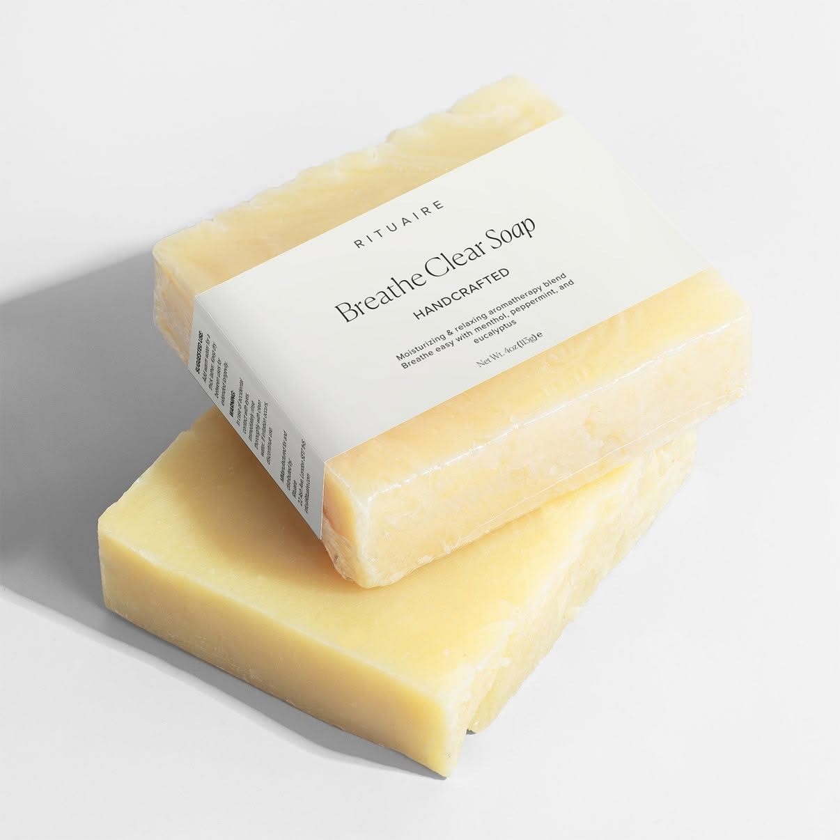
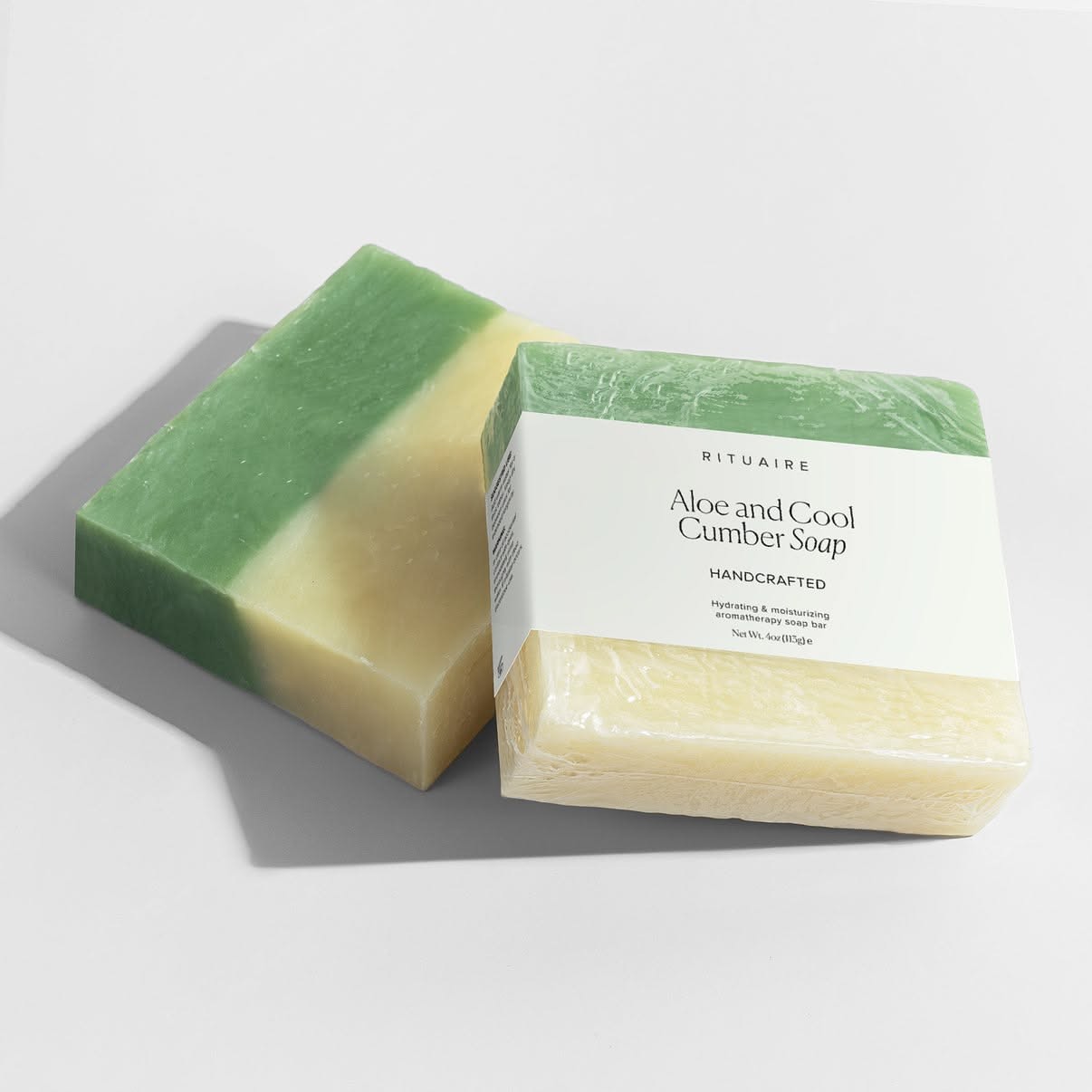
The soap line carries the identity on a paper sleeve, cut low so each bar's two-tone surface becomes the colour palette. Wrapped and unwrapped read as one object — the sleeve frames the soap rather than hiding it.
06
Packaging detail
At reading distance.
07
Product architecture
Four formats, one architecture.
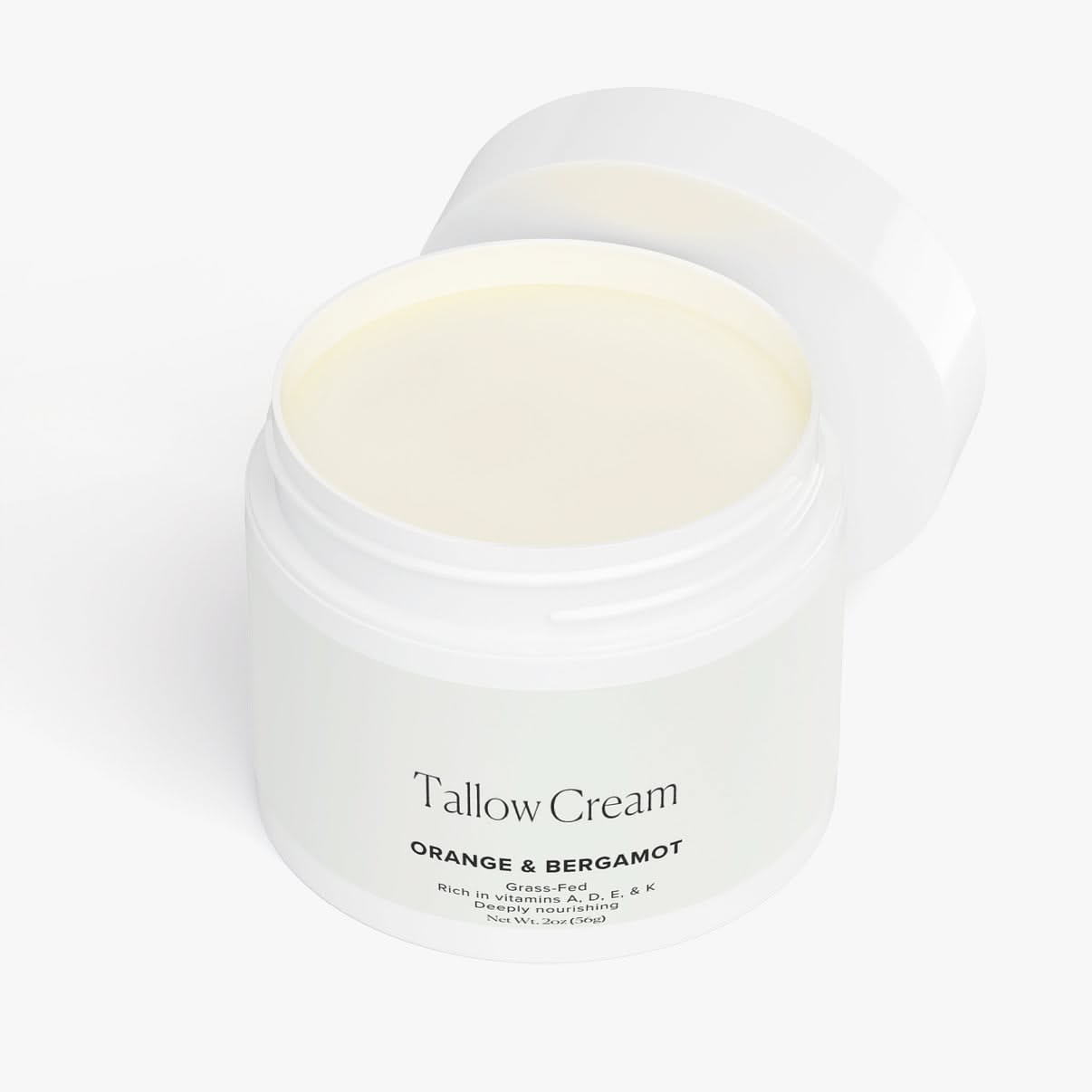
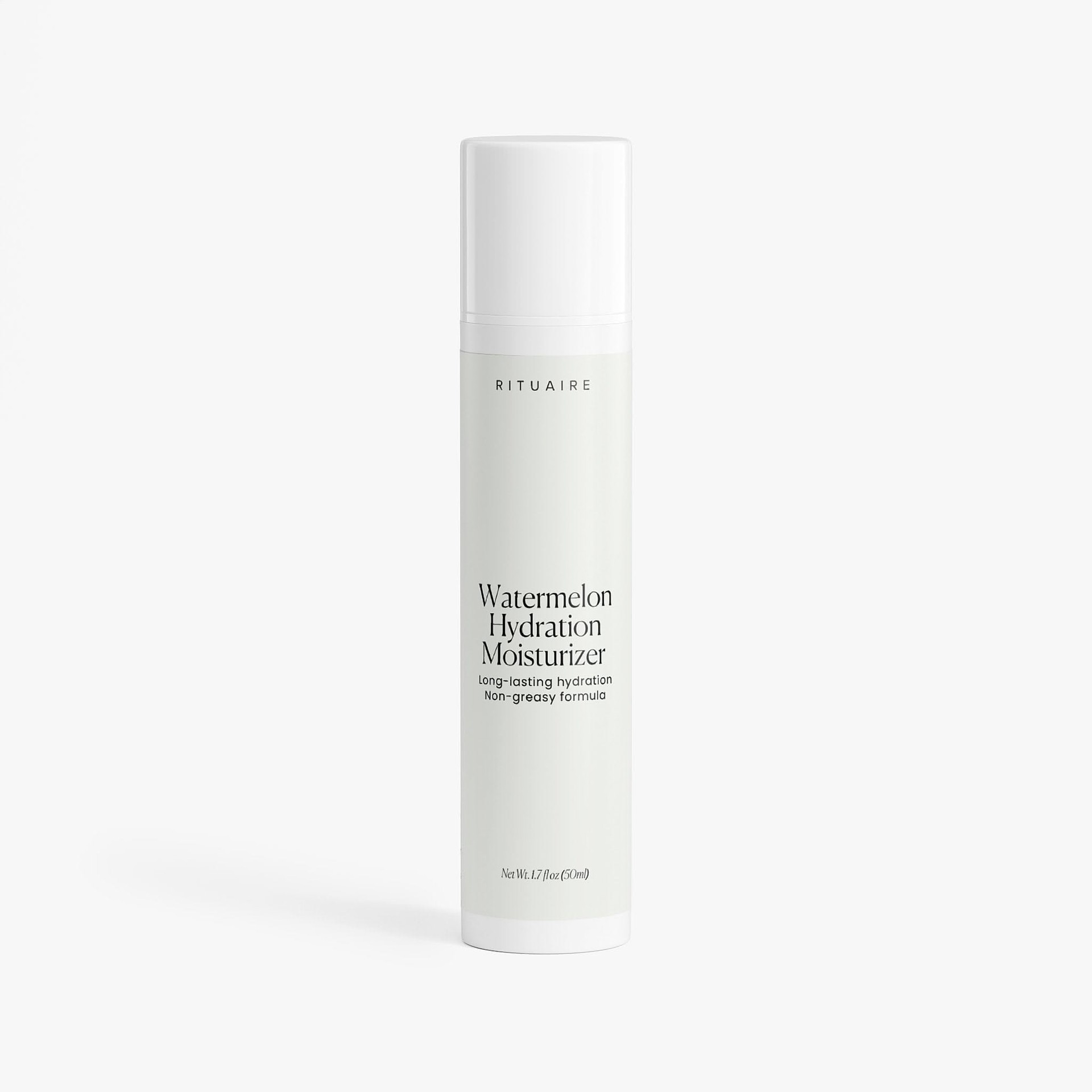
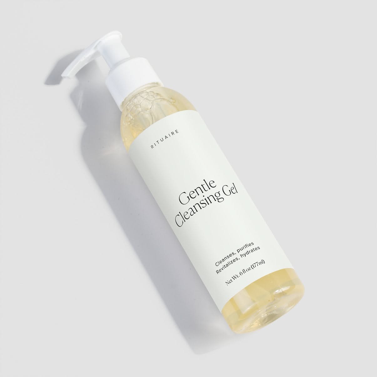
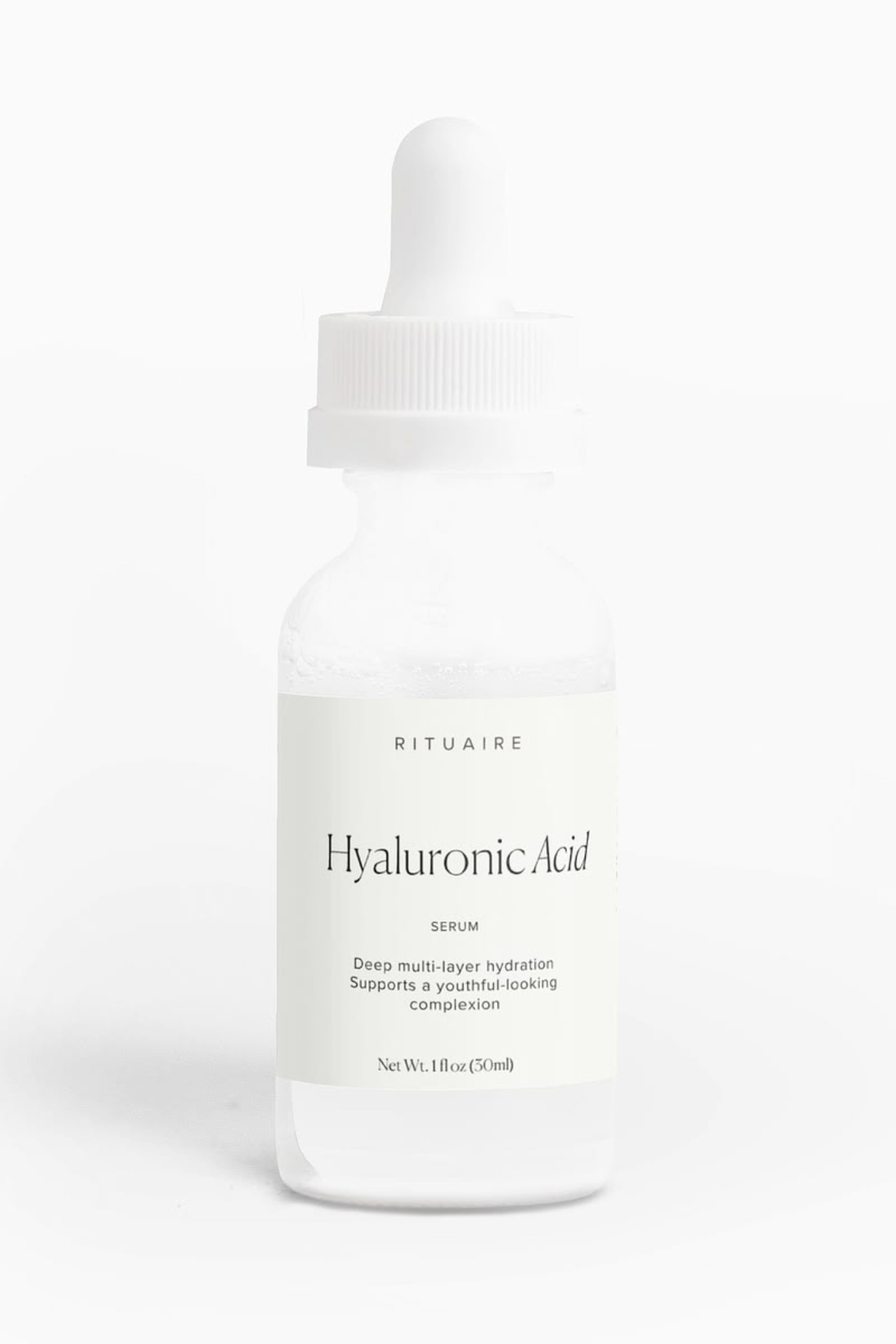
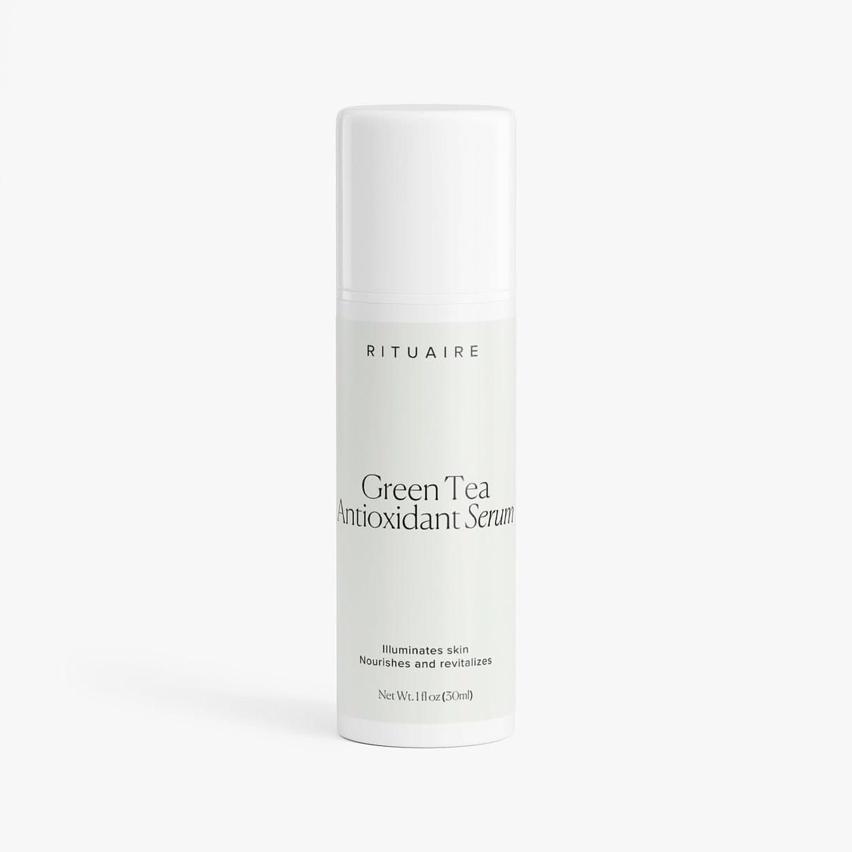
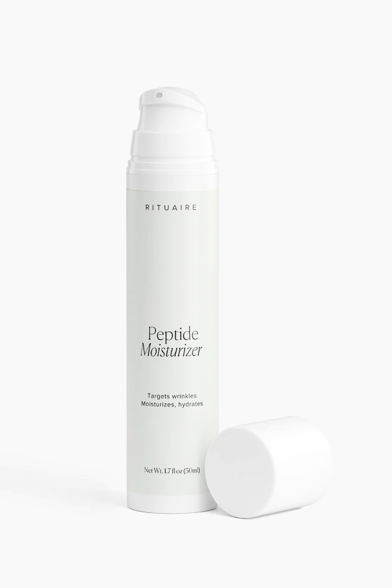
Jar, airless pump, dropper, bottle. The label architecture flexes across four very different proportions without changing its mind — wordmark high, serif name centred, function and weight low.



08
Editorial
One frame, left alone.
09
Production
Artwork that survives the printer.
Sleeves and boxes were produced as print-ready artwork — flat cuts, registered wraps, ingredients and weights set to regulation size. The system is designed for the moment the sleeve comes off: the bar underneath carries the colour story on its own.
10
Brand world
After the Ritual.
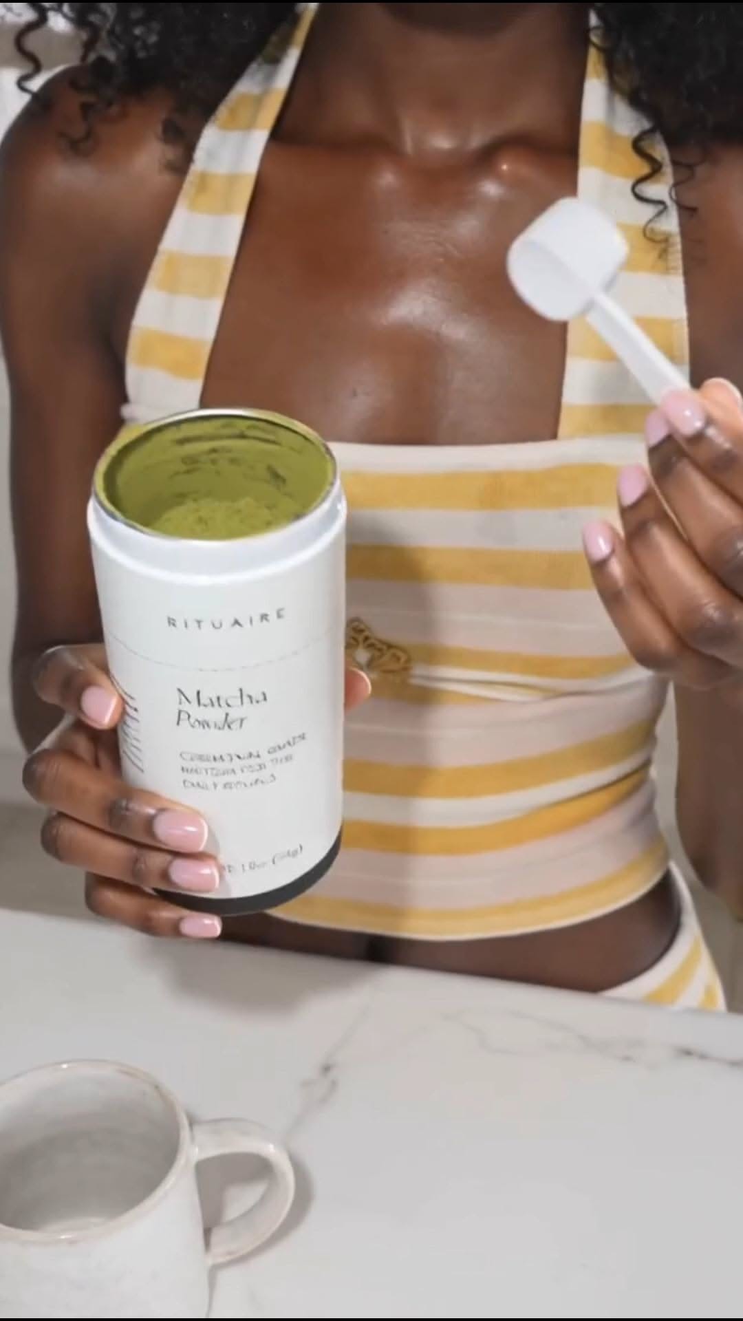
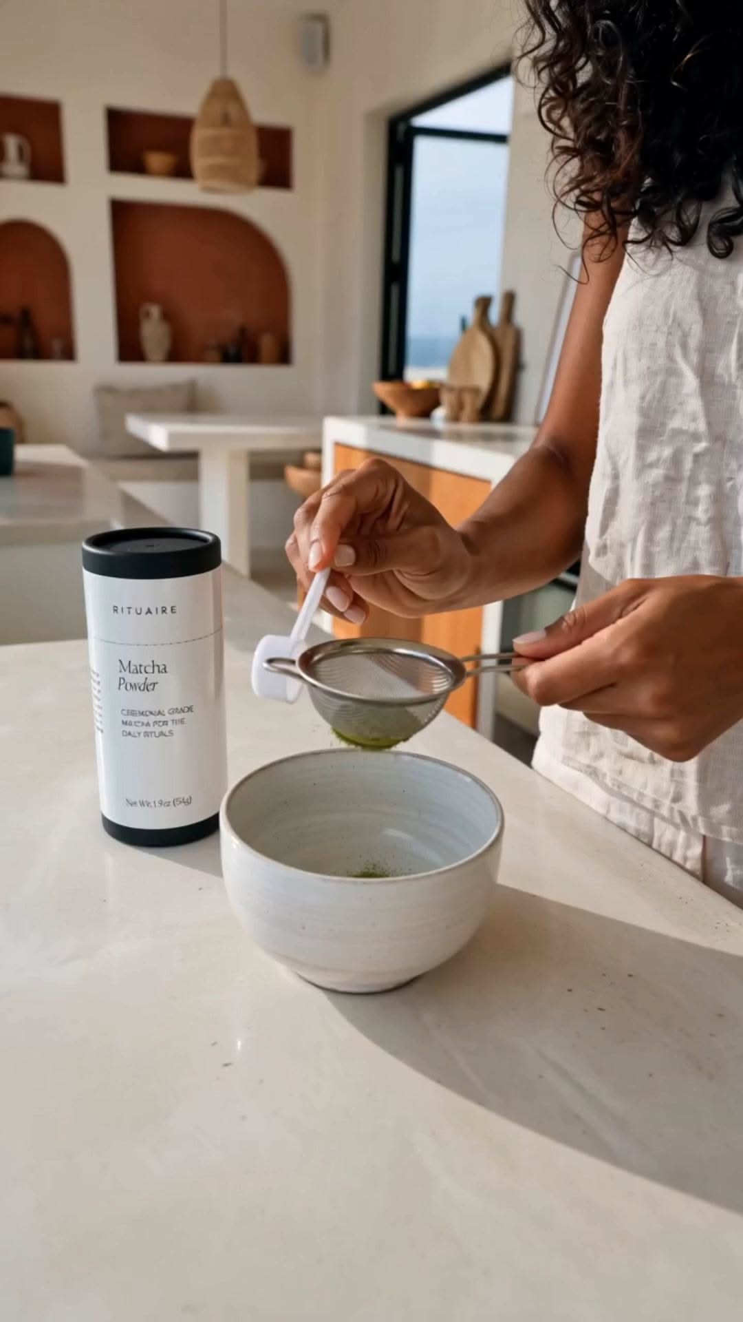
The content series extends the brand into daily life — morning kitchens, striped robes, the matcha tub open on the counter. Lo-fi by design: the world should feel lived in, not staged.
11
The range
Breadth, without drift.
The test of a packaging system is the fifteenth product, not the first. Serums, acids, oils and moisturisers all land inside the same architecture without a new idea being needed.

Selected deliverables
- Brand strategy
- Visual identity
- Packaging system
- Label & sleeve artwork
- Product architecture
- Art direction
- Campaign content direction
- Print production