
Brand · Packaging · Ecommerce · 2026
Ronika Beauty
Building a soft-life beauty world across brand, product and digital.
- Role
- Brand identity · packaging · ecommerce · campaign direction
- Industry
- Beauty · Lash & Lip
- Year
- 2026
- Location
- London
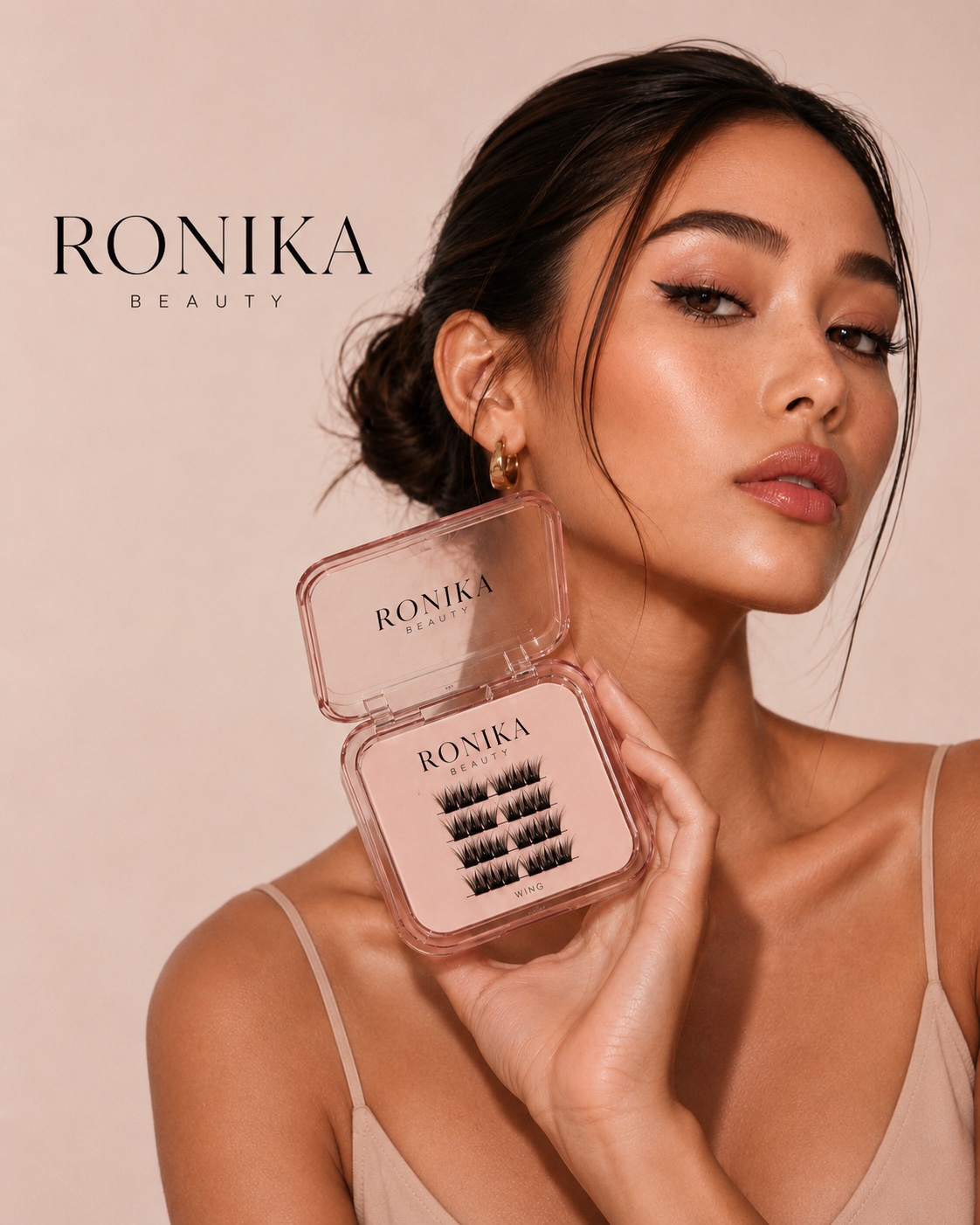
Ronika Beauty is a boutique lash studio and beauty line built around the idea of the soft-life ritual. The project was about creating one coherent visual world that could move seamlessly between beauty services, physical products, ecommerce, education and content.
Rather than following the visual language typical of lash brands — neon signage, hard-sell graphics and before-and-after imagery — I positioned Ronika closer to an editorial beauty house. Warm neutrals, portrait-led imagery, considered typography and tactile packaging create a quieter, more premium expression of the brand.
01
The identity
A quiet, tonal system anchored by espresso.
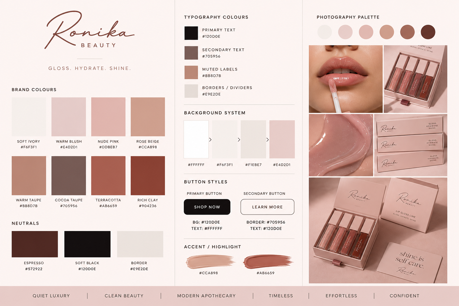
Espresso, ivory, blush, rose beige, taupe and terracotta form a warm beauty system that works as easily across packaging and ecommerce as it does across campaign imagery. The wordmark pairs wide-set editorial caps with a whisper-spaced "Beauty" — designed to feel like a small, considered label rather than a beauty logo.
02
Packaging
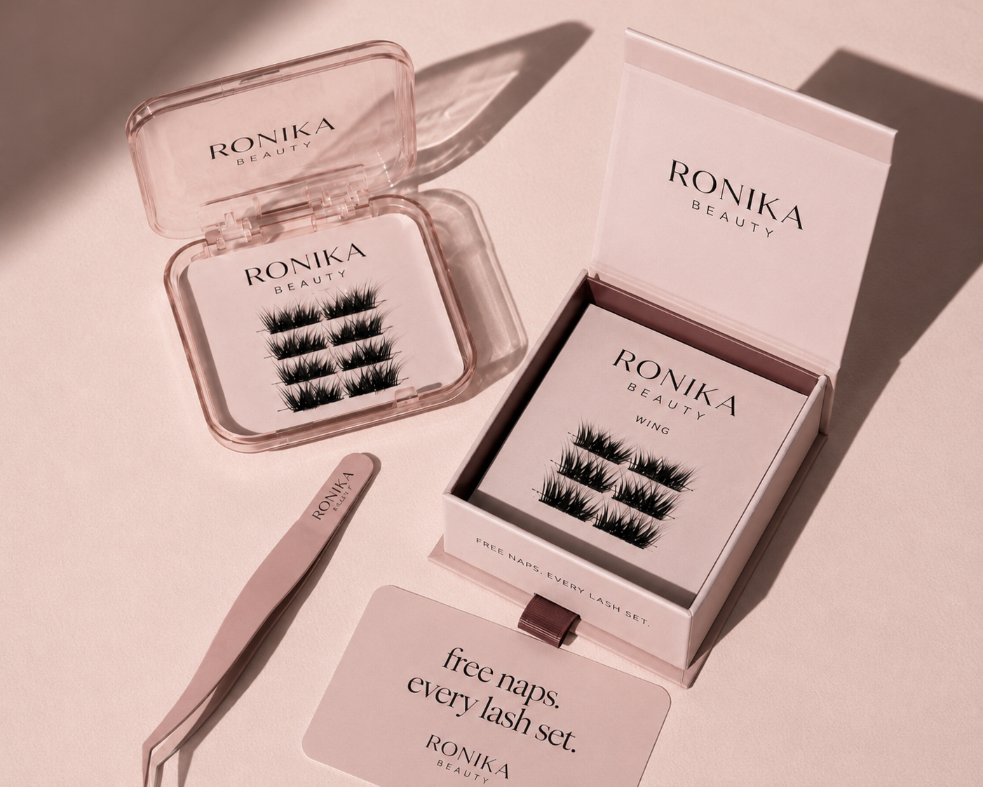
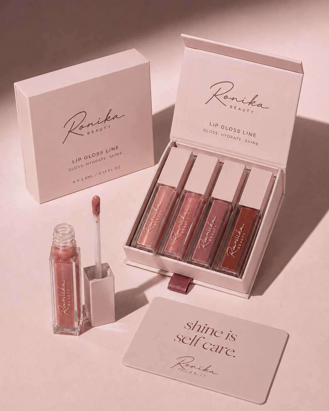
The unboxing became part of the brand.
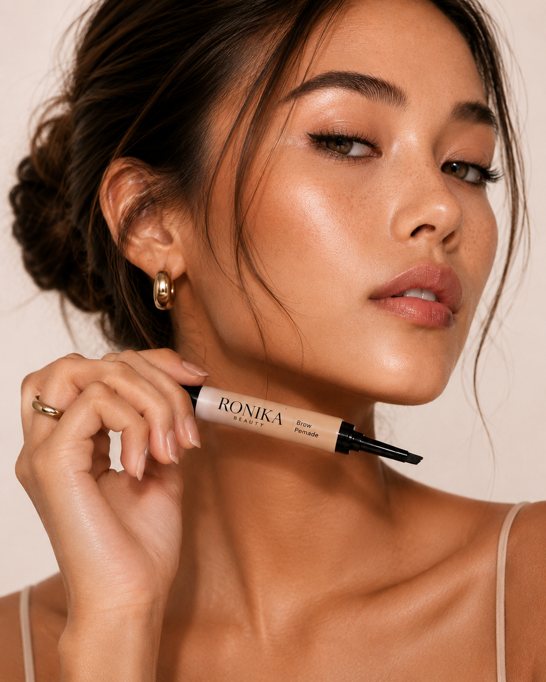
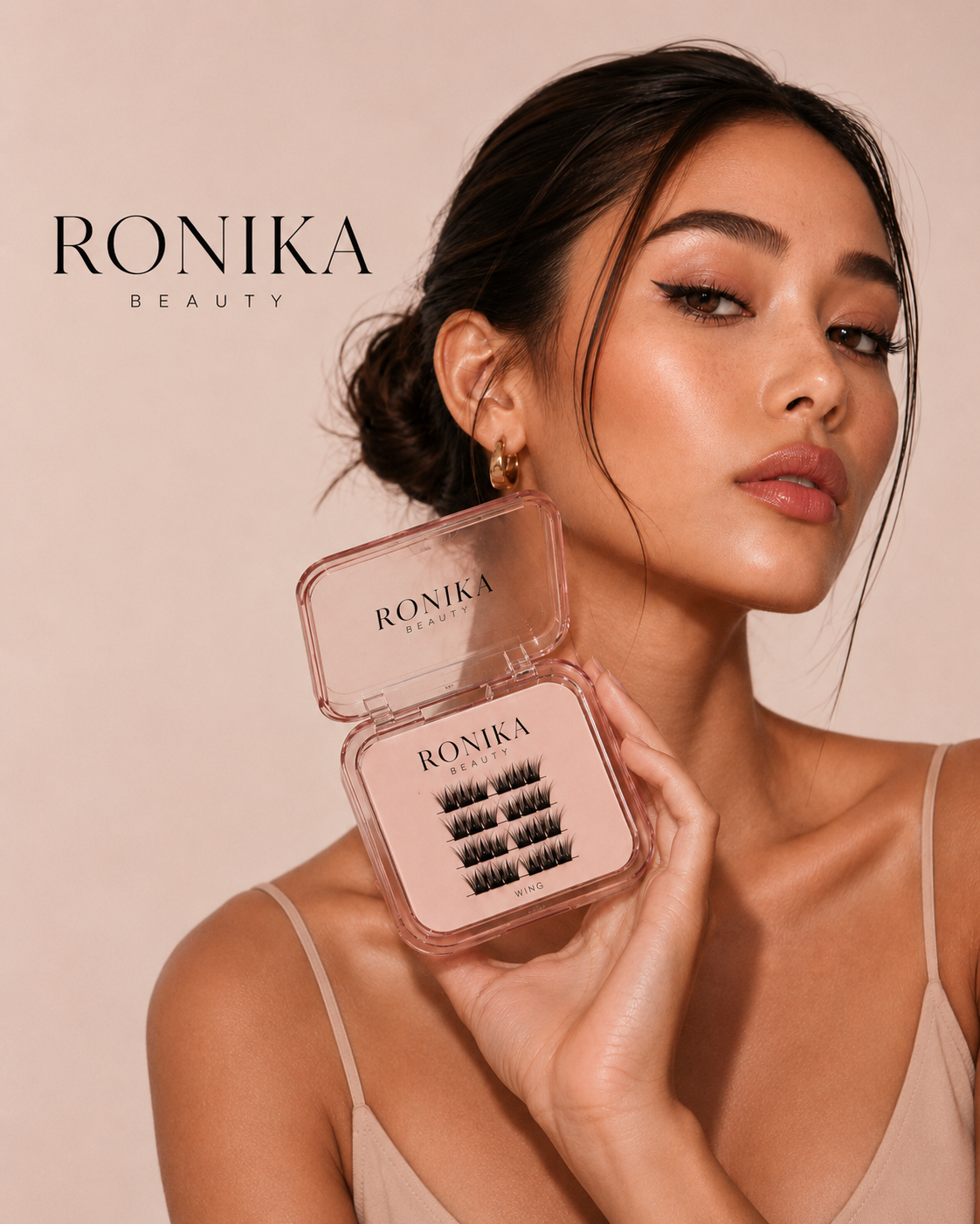
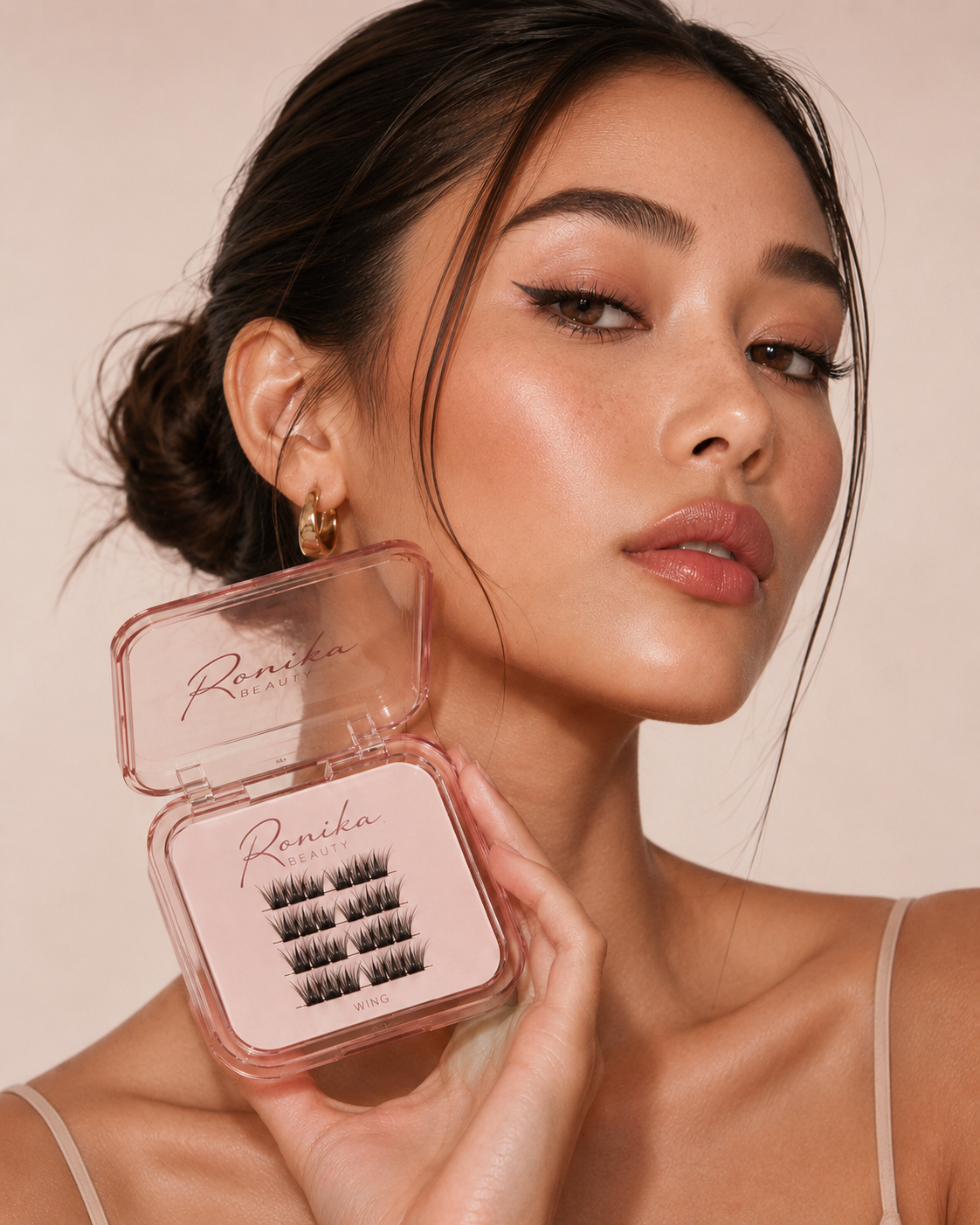
The Wing lash palette and the lip line were designed as a single unboxing moment — magnetic closures, blush-tone glass, and a printed inner card that carries the studio voice. I treated packaging as both a physical customer touchpoint and a content asset: every product shot doubles as campaign material.
03
Ecommerce
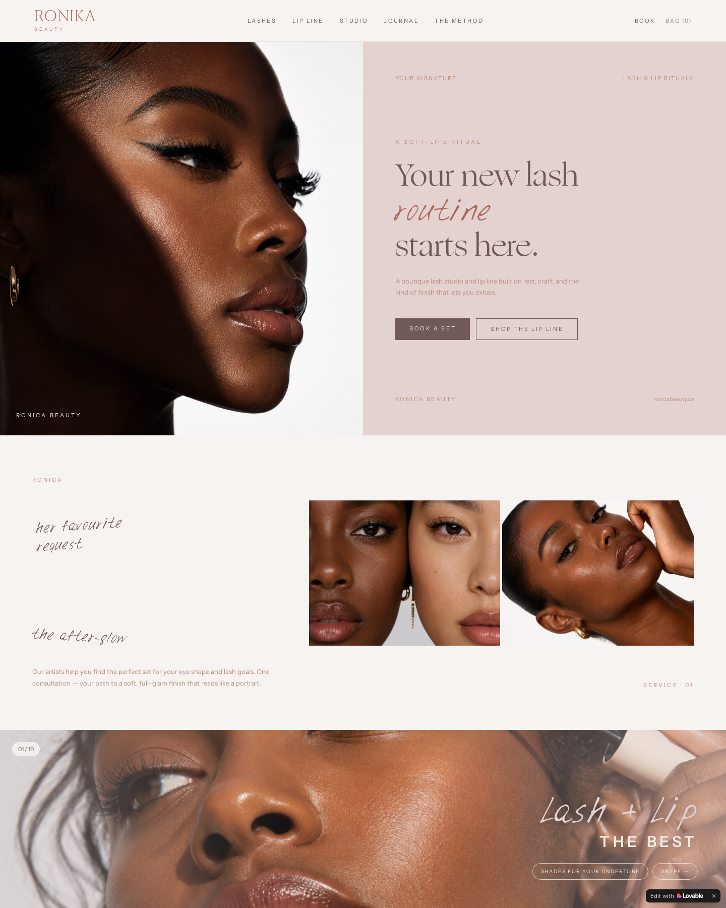
A boutique storefront, not a beauty megastore.
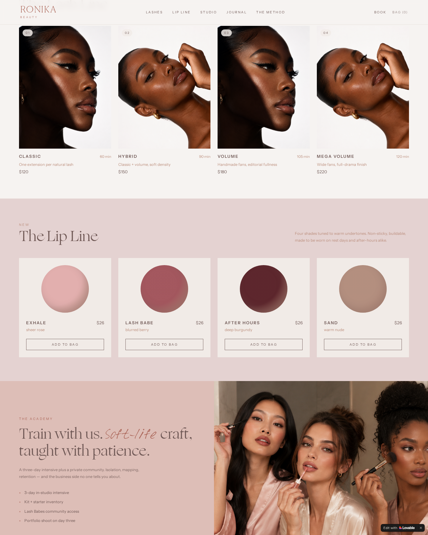
The digital experience carries the same editorial language as the physical brand. The storefront is built as a soft-life ritual walkthrough — portrait-led hero, a signature lash line, a lip line, journal notes and a booking path. Product and category pages are designed to feel more like a magazine than a checkout.
04
Creative direction
One ritual, every channel.
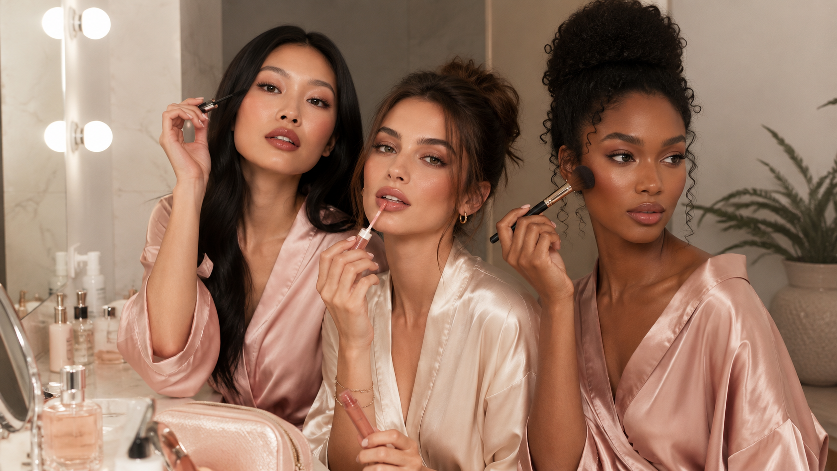
Morning light. Tonal makeup. Robes. Warm skin. Soft interiors. The campaign direction was built around a single ritual, so campaign, ecommerce, social and packaging photography all feel as though they belong to the same world.
05
Extended brand world
Beyond the storefront.
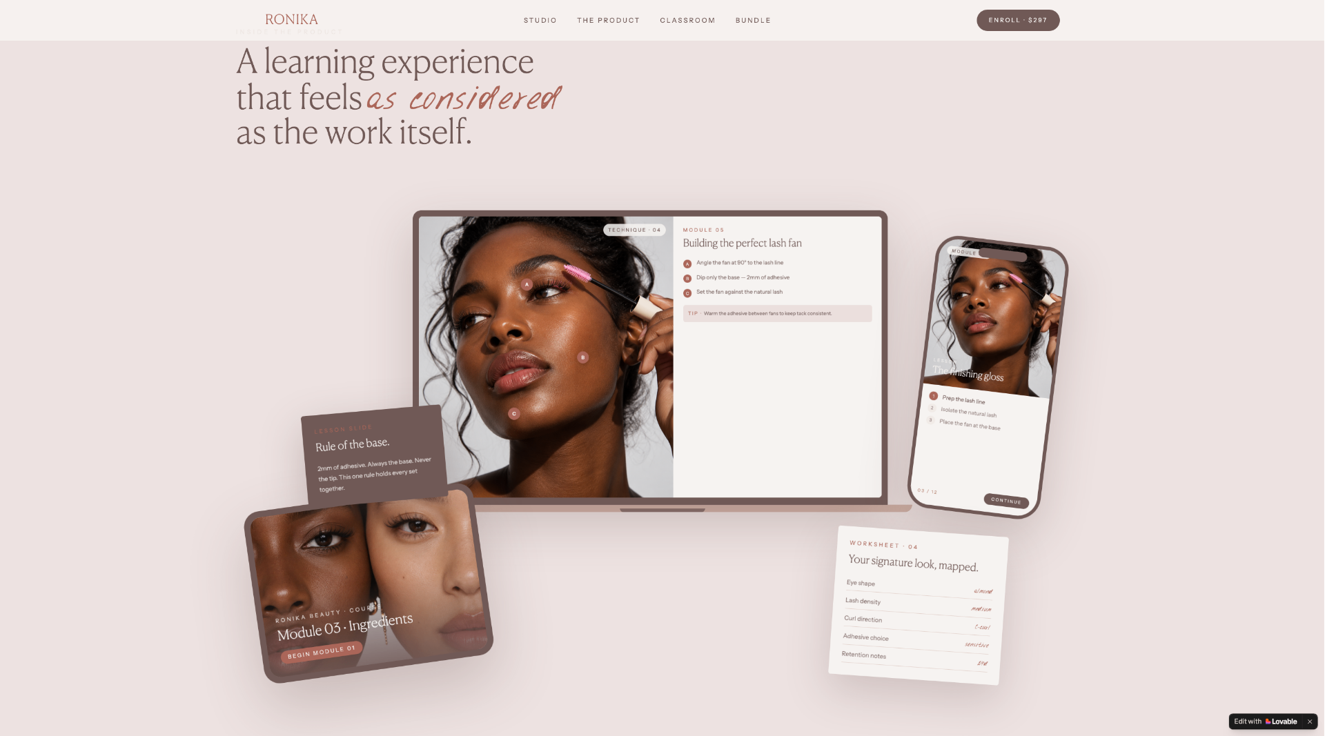
Beyond retail, the brand extends into the Ronika Beauty Method — a members-only classroom and editorial guide series for the Lash Babes community, turning clients into ambassadors inside the same brand world.
Selected deliverables
- Brand strategy
- Visual identity
- Packaging design
- Ecommerce design
- Booking experience
- Digital community experience
- Campaign direction
- Content system